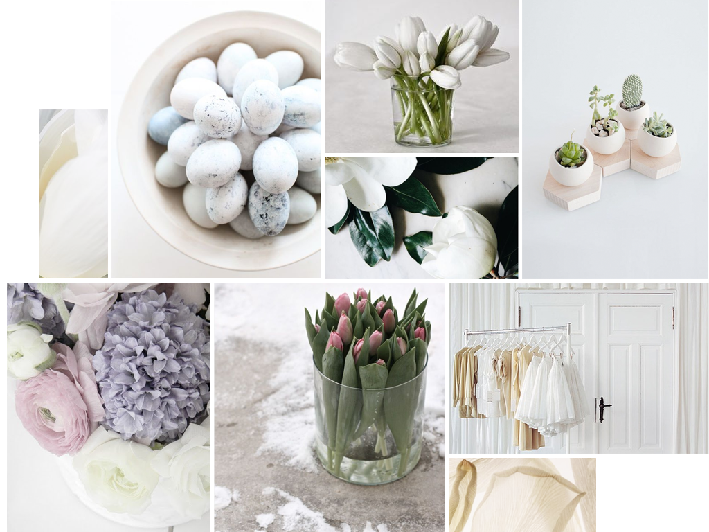
Spring Moodboard
It’s the time of year — that in like a lion, out like a lamb time — when winter melts into spring. As a designer I take visual cues and inspiration from my external environment all the time.
The transition from Winter to Spring is a tremendously inspiring time for me.
Colours still seem pale and muted with the low Winter sun, but the warmer tones are starting to peek through as we get closer and closer to 12 hours sunlight each day.
Use pastel tones in your brand if you want to evoke feelings of calm, soothing, and relief. These soft tones also create feelings of relaxation and openness in a brand.
What do you think of Spring’s soft colour palette?

