It launches June 13th – What you need to know
Facebook has done it again and changed the layout for business pages – this time I think it’s a great move! Here’s what you need to know about the new facebook pages layout:
1. Update Manually or Automatically
If you log in to your Facebook Page now, you’ll see the following notification:
Click “Update Now” to begin the update process on your own and manage the transition yourself. I suggest to not wait until Facebook automatically updates you – there are some image size changes that you’ll want to be prepared for. Don’t worry – Facebook is being nice and will allow you to play with your new page layout a bit before it goes live when YOU decide to publish it!
2. The first major change – Getting around
I’m happy about this change. Facebook has basically put all your management tools at the top of the page in four easy to locate navigation tabs:
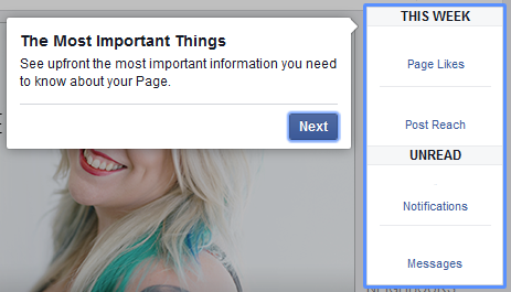
3. Change #2 – “The Most Important Things”
Facebook has put what it considers your most important notifications on the top right hand side of your screen underneath the help button:
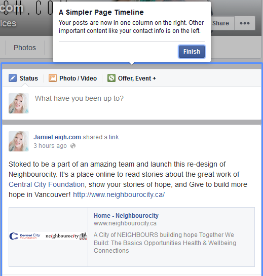
4. Change #3 – A Simpler Timeline!!
This is by far my most favourite change with the new Facebook Page. Was it just me or was that right-to-left-back-and-forth posting timeline a bit too disjointed to read? That’s gone with this new update. Yippie. Now the timeline is all neat and tidy in one row on the left of your page info (including your apps).
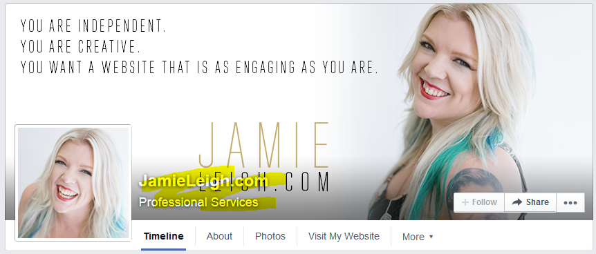
5. Change #4 – Beware of the new Cover Photo
Your cover photo may fit just fine, or some of your important components (for me, text) may be covered by the profile which has been raised a bit and the new text and share/engagement buttons:
Not a big deal! Just change that cover photo before you update your page. The image sizes are still the same: 180px x 180px for your profile picture and 851px x 315px for your cover photo. OR contact me if you’d like me to create a custom Facebook cover photo for you!
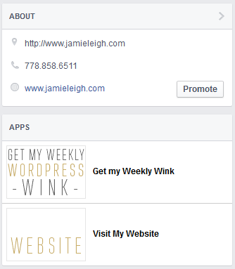
6. Change #5 – The Apps!
Instead of having images to link to your specific apps (which I thought was visually great for branding), the horizontal app list between your cover photo and your timeline are now text based. Facebook has, however, kept image-based app links as well! They are located in a vertical widget below the”About” section.
What do you think of the new changes? Have you updated your Facebook page yet? Let me know what you think in the comments below!
More resources on the new Facebook pages layout:
- Mari Smith: Facebook Page Cover Image Tool
- Rebecca Coleman: New Facebook Pages Interface
- Socially Stacked: Everything You Need to Know About Facebook’s New Page Design
