Ever start adding pages to your website, only to get overwhelmed and then realise 6 months later that you’ve neglected to include something really important like a method for folks to engage your services?
Developing a website can be super mind-boggling. There’s a lot of components to think about. Good news is that keeping it simple is the best way to make an impact and let your offering shine online. How do you do that? Well, get clear on your goals, simplify, and make sure that every element that you add to your site works toward achieving those goals. With that in mind here’s my list of the
6 most important website elements you’ll want to include:
1. Home page
This is the page that folks arrive on (sometimes referred to as a “landing page”) when they visit your site. It’s the first thing they see. This first impression needs to connect immediately with your ideal client.
The term “above the fold” gets thrown around a lot, and this is where it matters. Above the fold is a term borrowed from print media (Newspapers), and refers to the part of the page that is visible, literally, above the part of the newspaper that is folded in half. The content that appears on this part of the front page of the newspaper is important because it’s the first thing a person sees on the newspaper at the stand, and ultimately impacts their decision whether to purchase the newspaper or not.
In internet speak, above the fold refers to the part of your homepage that a person sees as soon as they land on it, without scrolling.
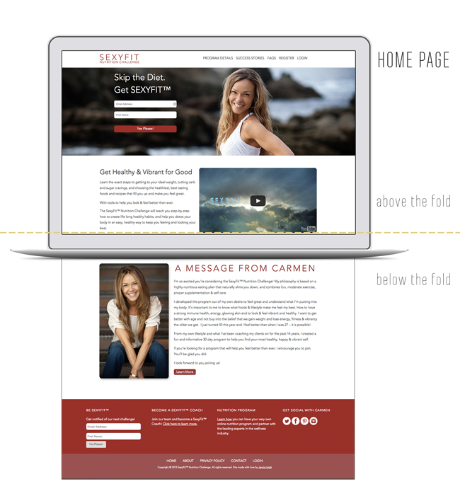
We now have so much more competition than a crowded newsstand — there are over X million websites as of 2014. With all that competition, it’s even more vital to capture attention immediately, speak specifically to your target market, and engage them within the first 10 seconds of them visiting your site.
So think about your website goals and make sure there is a call to action that meets the goal on your homepage, above the fold.
2. About Page
This is the #1 visited page on every website according to the great google – and contrary to popular belief its NOT so much about you, but more about your ideal client and what you can do for them!
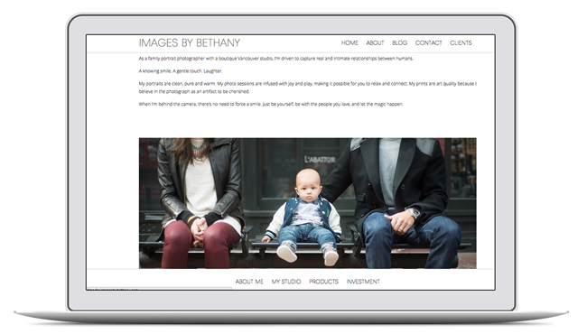
I’ve ran so many user tests on websites that I’ve built and you know what? As soon as a person lands on the site, gets to know what its about, they immediately look for an “About” link in the navigation to find out more information.
So use this page wisely. Talk about your ideal client’s pain points and how YOU are uniquely situated to solve them.
3. Contact Page
How do folks get in contact with you?
Do you have a brick-and-mortor space where folks can visit you? Do you want to connect via social media? Can they call you? Email you? How about connect via your email list?
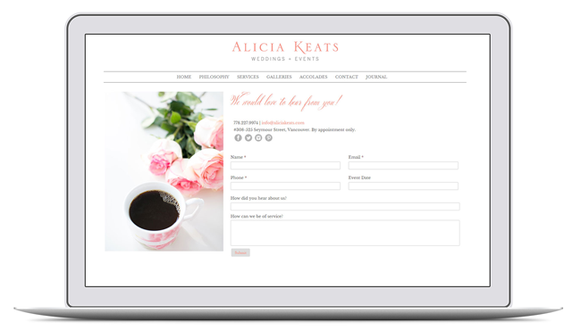
Make a clear path for people to get in touch with you once they fall in love with your offer!!
4. Privacy Policy and Terms + Conditions
Show your target market that you’re a legitimate business and respect their privacy. Have website terms, and a privacy policy, that clearly state what can and can not happen on your website, and what you’ll do with private information (like email addresses) that you collect.
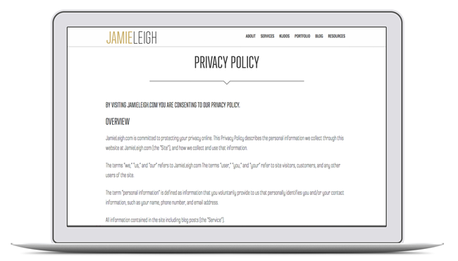
In some countries (Canada, EU countries, etc), it is a legal requirement to have clearly accessible terms + conditions and a privacy policy on your website. Don’t stress too much, though! There are lots of handy services out there like Small Business Bodyguard that sell lawyer-approved templates!
5. Your offering
This is either your portfolio of work, services page, or your store to purchase products! Even more than your about page, your portfolio of services, offerings, or products serve as proof that you do what you do!
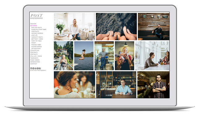
Make this page engaging and relatable. Go ahead and invite folks to purchase your products, retain your services, or view your bounty of wicked examples of work!
6. Footer
This often neglected space is high real estate on your website. Why? Well, if a person has scrolled all the way to the bottom of your site, you want to celebrate that, not leave them hanging!
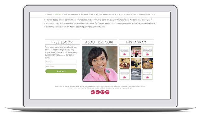
You can surprise and delight your website visitors by offering an extra sparkly freebie to folks who opt-in to your footer. Also give them more opportunities to engage with you: links to other pages in your site (footer navigation), links to your social media profiles, or even a super catchy video that connects + engages even further!
Pro Tip: Make sure that you include testimonials, opt-ins, CTAs, images, on each page!
Have these 6 website elements as a foundation and you’re good to go!
