So you wanna write a WordPress blog. It’s one of the BEST ways to share your unique genius with your people while delivering so much value and building your audience. You’ve got so many great things to share, it’s time to start sharing them online.
But how do you ensure that all of your great ideas are not only reaching your people but keep them coming back for more? You set your WordPress blog up with a strong foundation and follow some best practices for blog layout and what to include.
Here are my top five tips on how to get the most out of your WordPress blog:
1. Don’t make your users think too hard
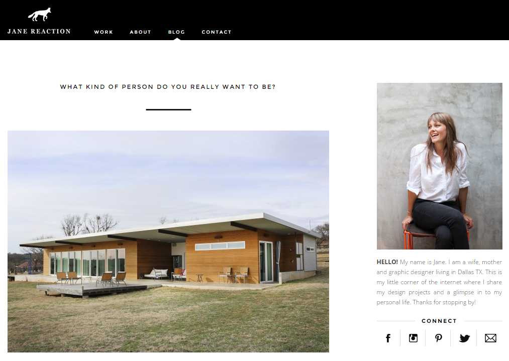
Have clear navigation. This one really hurts us creatives because we LOVE to be specific and creative about our titles, meaning our navigation can end up reading like a confusing yet very on-brand jumble of nonsense. The “About” page is the most visited page on every website, so make it clear that yours is all about you — don’t name it “thunderbolts and unicorns.” Name it “About Me.”
I know “About” “Services” “Kudos” “Blog” “Resources” may SEEM really boring, but they’re actually super user friendly. You’ll get more engagement when your navigation is clear.
2. Onboard newbies
If blogging is your primary Jam, have a “Start Here” page where you introduce yourself, your blog, and onboard new website visitors! This page should go into more detail about why you do what you do, and where to start. You can put links to your top ten posts, frequently asked questions, media kit info, and more on this page.
Just make this a place that takes the question outta your online presence for new visitors.
3. Less is more
You know that junk drawer everything gets shoved into but nothing gets removed or used?
If you’re like me, you’re afraid to even OPEN that drawer. Who knows what’s going to jump out at you!
When someone visits your site and finds themselves attacked by popups, buttons, advertisements, and a plethora of social share/follow icons, they might feel too overwhelmed to even stick around.
Keep it clean and simple. The eye reads in an F shape so place your most important content should be in the top left-to-right hand sides of the page. Remember to take advantage of white space, lists and headings.
4. Be descriptive
Always give your blog posts and pages title that describe the kind of content folks are going to read on that page or post. The same goes for photos: rename each of your photos (and resize them for internet use) before you upload them to WordPress.
Please don’t use random or generic titles such as DSC1234.jpg or First Blog Post — Google will totally ignore it, and your audience won’t be able to find you.
Instead be thoughtful and intentional when naming pages, posts, images, categories, and tags. Think about the content of your blog post and how you can use these words in your post title, images, categories, and tags. Being descriptive will help people find you better through search engines and navigate your site easier once they’ve found you.
5. Avoid CTA (Call-to-Action) Confusion
It’s tempting to ask readers to do a whole buncha different things at the end of your post: share, sign up, buy, throw confetti, participate in your annual hula-hoop instagram contest, etc.
But if people have too many choices, they’re unlikely to do anything at all. Instead, make one strong call to action. Be mindful of your audience and only ask them to do one thing at a time. For example, if you’re writing a sponsored post and you’d like folks to click on an affiliate link, don’t ALSO ask them to fill out a survey. Save that for your next post and your conversion rates for both CTAs will be higher.
So there ya have it. My top 5 tips on how to get the most outta your WordPress Blog. Bottom line? Think about every part of your website as an opportunity to educate your viewer and reinforce your brand identity. Keep it clear, concise, and simple. The most memorable website experiences are those in which the message is fully understood.


