
Branding is not just the work I do; it’s one of my obsessions. (Other obsessions include sequins, #vannin, and Back to the Future.) While there are certainly best practices for branding, I tend not to follow secret formulas or get uptight about tactics when I’m working with clients. The Jamie Leigh Guide to Branding Fundamentals is a five-part series that introduces you to some of the principles, psychology, and processes that I’ve developed in my 15+ years of working with online business owners. Whether you’re starting from scratch with a new business idea or contemplating a re-brand of your current business, this series will help you approach your branding project with greater know-how and ease (because we could all use more of that in our lives).
The five branding elements I’ve covered in this series are clarity, colours, fonts, logos, and consistency.
Colour (that’s color for you U.S. folks) is one of the single most amazing—and important—tools in brand recognition.
When you learn the psychology behind colour, your branding colours can speak to and attract your most valuable clients. People are visual beings and colour evokes emotion, reinforcing your brand characteristics.
Colour makes your brand memorable and is one of the main factors in your audience’s perception of you.
Colour plays an essential part in life for everyone! Yes, even for people who have difficulty with seeing colour or are colour blind. Colour has a vibrational energy that affects your body, mood, and health.
For your business branding, you can use colour to gain your audience’s attention, put them in a specific frame of mind, and positively impact their emotions. (Of course it should go without saying, but just in case: I’m talking about using colour psychology in healthy, supportive ways with your ideal customers, not for manipulation.)
With an infinite number of possible colours and colour combinations out there, it can be hard to decide which colours to choose for your branding.
Often I watch entrepreneurs just pick their favorite colours for branding instead of taking the time to understand (or work with someone like me who understands) the psychology of colours’ affect on their audience.
Take a moment now to think about the characteristics you want your brand to have, if you haven’t already.
The Meaning of Colours for Branding
Before we get into the meaning of colors for branding, I want to add a caveat that the definitions below are associated with western, North American values. In different regions and cultures around the world, colors have contrasting meanings (particularly with black, white, and red).
Let’s get into the meaning, values, and emotions associated with the major colours now.
If you already have an idea of your brand’s values, qualities, and characteristics, keep those in the front of your mind as you continue reading this post.
While you’re reading through the colours below, try to leave your personal colour preferences at the door and really pay attention to the description of each colour as they relate (or don’t relate) to your brand.
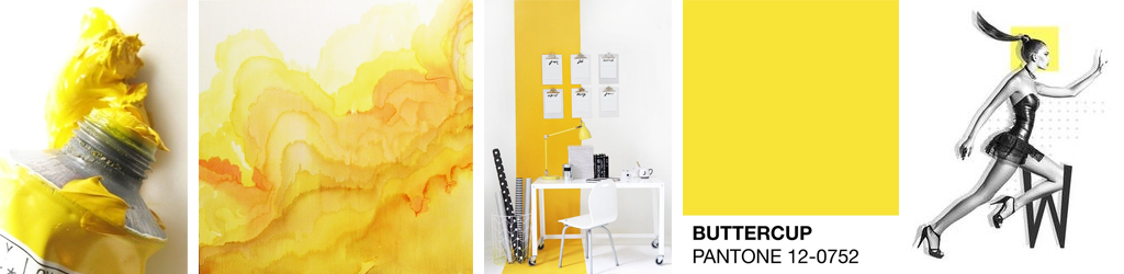
Yellow as a Brand Colour
Yellow is associated with positivity, warmth, sun, youth, play, and clarity. It evokes emotions such as happiness, joy, and optimism.
Orange as a Brand Colour
Orange is associated with confidence, friendliness, energy, warmth, creativity, youth, and affordability. It evokes emotions such as cheerfulness, enthusiasm, and openness.

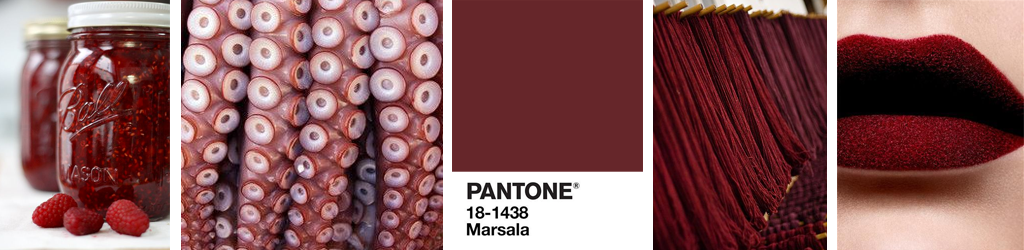
Red as a Brand Colour
Red is associated with power, love, appetite, danger, energy, and adventure. It evokes emotions such as excitement, passion, and boldness.
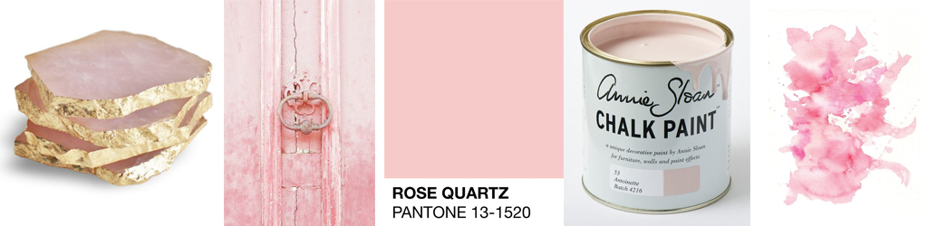
Pink as a Brand Colour
Pink is associated with innocence, femininity, romance, fantasy, softness, flexibility, and appreciation. It evokes emotions such as empathy, love, and compassion.
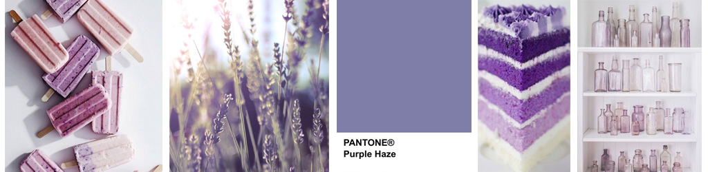
Purple as a Brand Colour
Purple is associated with royalty, mystery, spirituality, creativity, wisdom, luxury, extravagance, glamour, and fantasy. It evokes emotions such as bravery, transcendence, and nostalgia.
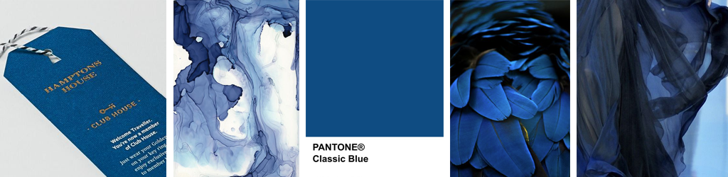
Blue as a Brand Colour
Blue is associated with authority, trust, loyalty, masculinity, stability, confidence, dependability, safety, and serenity. It evokes emotions such as peace, calm, and security.
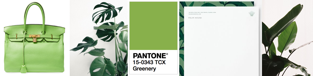
Green as a Brand Colour
Green is associated with growth, evolution, money, healing and health, the environment, nature, freshness, safety, relaxation and balance. It evokes emotions such as serenity, prosperity, and progress. Pantone has chosen Greenery as it’s 2017 colour of the year; “A refreshing and revitalizing shade, Greenery is symbolic of new beginnings.”
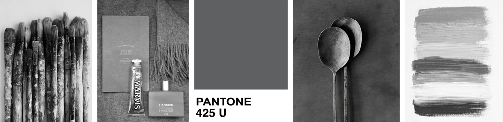
Grey as a Brand Colour
Grey is associated with wisdom, neutrality, acumen, sophistication, intelligence, and balance. It evokes emotions such as calmness, peace, and serenity.
Brown as a Brand Colour
Brown is associated with the outdoors, earth, food, depth, simplicity, and reliability. It evokes emotions such as fidelity, strength, and trust.

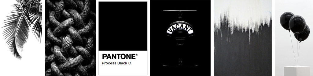
Black as a Brand Colour
Black is associated with formality, luxury, sophistication, power, authority, elegance, secrecy, distinction, and tradition. It evokes emotions such as security, wisdom, and unity.
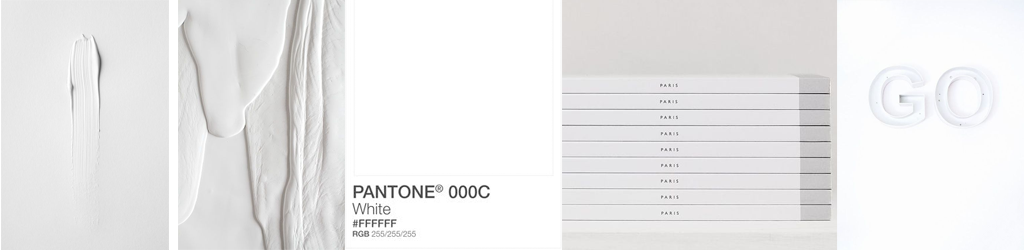
White as a Brand Colour
White is associated with purity, modernity, simplicity, innocence, sincerity, and freshness. It evokes emotions such as virtue, peace, and honesty.
Based on what you’ve read, are you finding that certain colours stand out as aligning with your business values?
Putting Together Your Brand’s Colour Identity
Now that you’re starting to think intentionally about how to match your business’ values and the emotions you want to evoke from your audience with your brand colours, let’s take a look at how to put colours together to generate your brand’s colour scheme.
Your brand’s colour scheme is the mix of colours that make up your brand identity. It sets the overall mood for your brand. Ideally, you have no more than three brand colours that make up your colour scheme—one dominant and two supporting colours.
There are three types of colour schemes: monochromatic, analogous, and complementary.
Monochromatic Colour Scheme
A monochromatic colour scheme uses different shades of the same colour. This is a good option to choose for minimalist, subtle, and calm brands.

Analogous Colour Scheme
An analogous colour scheme pairs together colours that are next to each other on the colour wheel. Typically you’d choose either cool or warm colours. You’d pick this colour scheme if you have a peaceful, harmonious, and relaxed brand.

Complementary Colour Scheme
A complementary colour scheme uses opposite colours in the colour wheel for maximum contrast and design stability. This option is good for high energy, high impact brands.

Which colour scheme sounds like it would best fit with your brand vibe?
Once you choose a colour scheme, you can add colour values to add diversity, depth, and originality to your brand identity. For example, you can tint or shade colours by adding white or black, respectively, to the colour profile.
Consider this post your invitation to be intentional when choosing your brand’s colours during the branding process—instead of simply picking your personal favourites.
Colour is a powerful branding tool when it comes to connecting with your Most Valuable Clients, which is why giving yourself time and space to decide on your brand colours is essential.
I believe branding is a process, not a destination. Like the best things in life, your branding will likely get more and more refined over time.
P.S. If you’re looking for a design pro to partner with you on your brand colours, I’m now booking my Signature Design Package for early 2017.