
Branding is not just the work I do; it’s one of my obsessions. (Other obsessions include sequins, #vannin, and Back to the Future.) While there are certainly best practices for branding, I tend not to follow secret formulas or get uptight about tactics when I’m working with clients. The Jamie Leigh Guide to Branding Fundamentals is a five-part series that introduces you to some of the principles, psychology, and processes that I’ve developed in my 15+ years of working with online business owners. Whether you’re starting from scratch with a new business idea or contemplating a re-brand of your current business, this series will help you approach your branding project with greater know-how and ease (because we could all use more of that in our lives).
The five branding elements I’ve covered in this series are clarity, colours, fonts, logos, and consistency.
Fonts are as important as colour for your business branding. They frame the way people visually understand your brand.
The right font can increase your brand recognition and professionalism, and sets the tone for people’s experience of interacting with your brand. And of course, it’s in the pairing of colours and fonts where your brand can truly come to life and stand out.
Like anything in design, you want balance, contrast, consistency, and a hierarchy with your brand’s fonts. Typically, you’ll have two main fonts (used for body text and headlines) and one accent font (used sparingly).
There are two basic font styles—serif and sans-serif—and your brand identity will likely be composed of one serif font, one sans-serif font. Of course, there are exceptions to that rule that work beautifully, depending on the brand effect you’re going for. And there’s a third font style—display fonts—that you can add into the mix as well.
How can you make sure you have contrast and balance with your font choices, aligning with design principles that will professionalize your brand? Let’s take a closer look at the different font styles and what kinds of brands are best suited for each font style.
Serif Fonts
These fonts have little “feet” or lines attached to the ends of the letters. This increases readability of text, and you’ll find that most books, for example, use serif for their font.
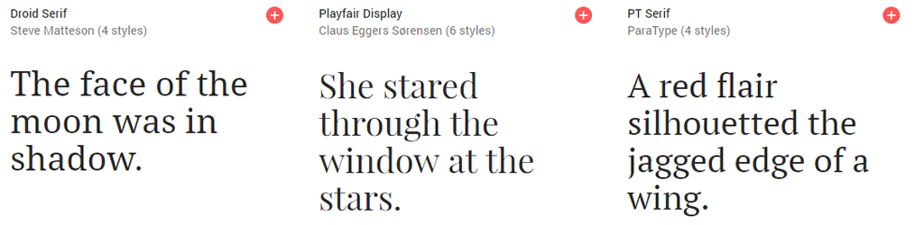
Serif fonts are best for brands that are traditional and classic, and want to communicate elegance and sophistication.
My favorite serif fonts are Lora, Garamond, and Merriweather.
Sans-Serif Fonts
You can distinguish these fonts from serif because they don’t have the extra lines on the ends of the letters. (The name sans-serif means “without serif.”) These fonts are typically easier to read on digital screens.
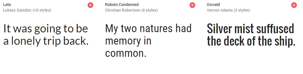
Sans-serif fonts are best for brands that have a more modern or minimalist vibe, and want to communicate simplicity and futurist-thinking.
My favorite sans-serif fonts are Montserrat, Roboto Thin, and Ristretro Pro.
Display and Script Fonts
Display fonts are highly stylistic and make a bold statement. I include scripted fonts in the category of display fonts, whereas some designer refer to them as their own distinct categories.They’re meant to be used sparingly and never for body text.
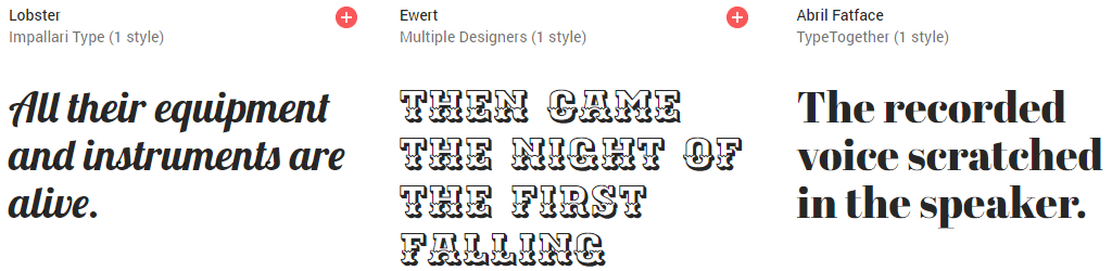
For example, Ewert is a quirky display font that gives out a circus vibe. There would only be very few, specific places that you would intentionally use a font like this.
Display fonts are best for brands that evoke strong emotions. Some are creative and lighthearted, and want to communicate a playful, personal vibe, others may be cutting edge and radical and want to communicate a stand-out, unique vibe.
I tend to change my mind a lot when I find fun new display fonts, but my current favorite display fonts are Caslon Graphique and Catalina.
My Favorite Font Pairings
I love using a serif and a sans-serif font for my signature websites, and adding in a complementary display font for special features such as buttons, calls to action, and social graphics.
If it feels restrictive to choose just two fonts, remember that you can use different weights in the same family (i.e. light, italic, bold).
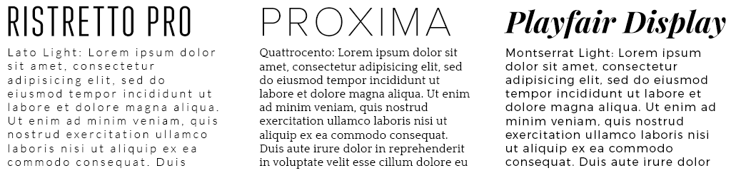
Here are some of my favorite font pairings at the moment to get your imagination going with possibilities. Ristretto Pro Regular + Lato Light; Proxima Nova Thin + Quattrocento; Playfair Display Italic + Montserrat Light.
A good font choice works very subtly to enhance one’s brand. When a font is a seamless extension of your brand, it allows your work and offerings to shine. (And when it’s bad, it’s usually so glaring as to be a complete turn-off for readers.)
Want to work with me to create your signature brand identity—including a custom font pairing—that magnetizes your audience and sets you apart in your industry?
I’m now booking for website design packages for 2017. Is one of the spots yours?